Recent Post
Saturday, November 24, 2012

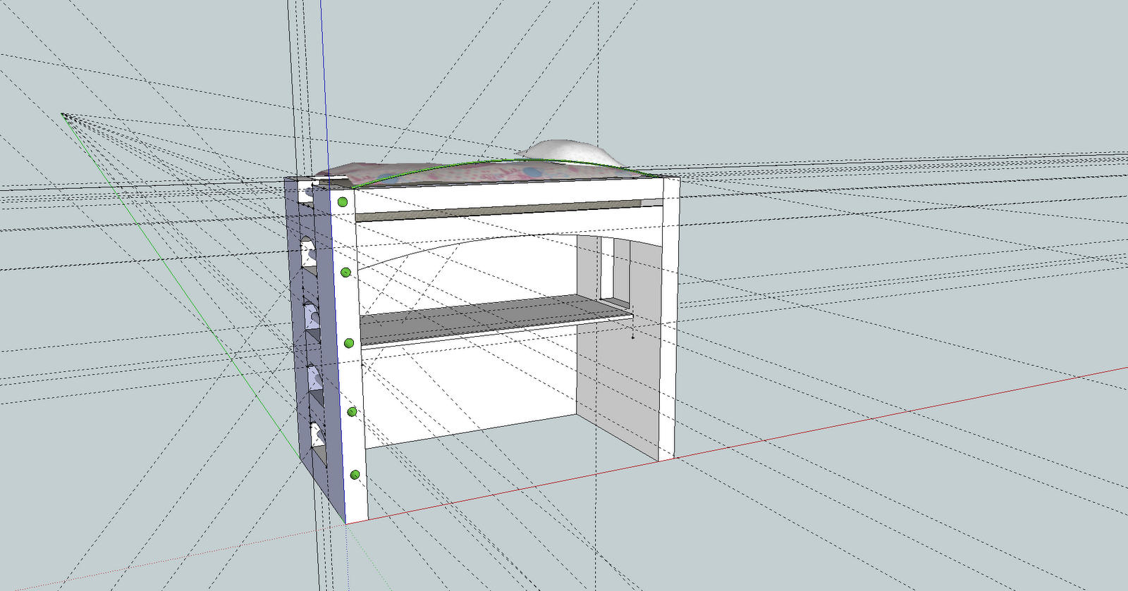
Daughter's Bedroom II
Enjoying the Thanksgiving weekend? I sure am! Typically, if there is something I don't like, and it's within my control to change, I change it. My daughter's room was such an example. In my previous post, Daughter's Room I, I started exploring another software application called Sketchup. Well, now I am finding myself using it quite a bit more. I'm no master, by any stretch, but the majority of CAD blocks I find and download, I am almost always tweaking in some way.
To start, the renders to follow were changed to scale back the bunk bed. Once I did this, and re-imported the model, I started to see more space to play with.
Afterward, I forwarded the basic changes to my pro-colleague. She promptly replied giving me advice to raise up the bookshelves to bed level, to create a space where one could place a drink, phone, or other small item while relaxing in bed.
What a great idea! Only, I didn't stop there, I took the bookshelves all the way up, added more bookshelves, crown molding, and my new favorite... an awning with window seating!
To keep my daughter's tom-boy spirit, and well, really to distract her from all the pink, I added a few Transformers models I found (which, btw, are incredibly detailed).
I'm still playing with colors a bit. I've got an idea to paint massive streaks of colors, like waves against the back wall of the book cases, or even the ceiling. We'll see. There's a few other compositional flaws, piggy bank is falling off the shelf, Jetfire looks a little scrawny next to Bumblebee, and his SR-71 is just floating there, the awning is a little lop-sided, and most obvious, there's a lot of empty shelf space.


UPDATE:
- Removed Jetfire, added Iron Hide
- Added Teddy Bear
- Painted ceiling green
- Painting cabinet knobs white
- Added blue-stained end trim
- Adjusted piggy-bank


Thanks for following along!
Wednesday, November 21, 2012

Daughter's Bedroom I
Many of the nick-nacks I place in my renders, come from Google's 3DWharehouse, which is a gigantic collection of 3D models people have designed with a free application called Sketchup. Supposedly, this little program is touted as everything a normal CAD program is not. In other words, it's easy to learn.Next on my list of rooms, is my daughter's room. She's 7 years old, and really wants a bunk bed.
I pawed through a number of bunk bed models people had published, but I either did not like them, or when I went to import them into Chief, they caused the ray-tracing engine to freak out. Hmmm... do I want to create one myself? Sure why not! So I set out watching a couple of the training vids, and before I knew it was able to design her a bunk bed using Sketchup.
Here is a render of my accomplishment for the day.
 |
| Daughter's Room |
Similar to the niche I created downstairs, I like the curve canopy beneath the bed frame making space for a dedicated desk, or homework space. A comfortable office chair and office mat, is a nice touch, making the room a practical, private, dormitory. I like the colors of the room, they are a compromise for a girl-gone-tom-boy, and the chair rail creates a nice division.
I'm not sure I like the extension of the head board into a modern set of shelves on the right. The coat-hook is OK, but I don't think it's a good use of wood, and not very functional because it's so narrow.
I'm not sure I like the drawer-steps combo she'll use to climb up to the bed. I've seen this characteristic on many commercial bunk beds, but for such a small room, these steps tend to dominate the space. Perhaps good though for sticking extra toys, socks, whatever, but again, not sure.
I definitely tend to think these bedrooms are on the small side, so for this room, perhaps busting through the adjacent wall to create a larger bedroom would help! Might not bode well for resale though, or you families that have more kids.
UPDATE (11-24-2012):
Here is the elevation for the room depicted in the render:


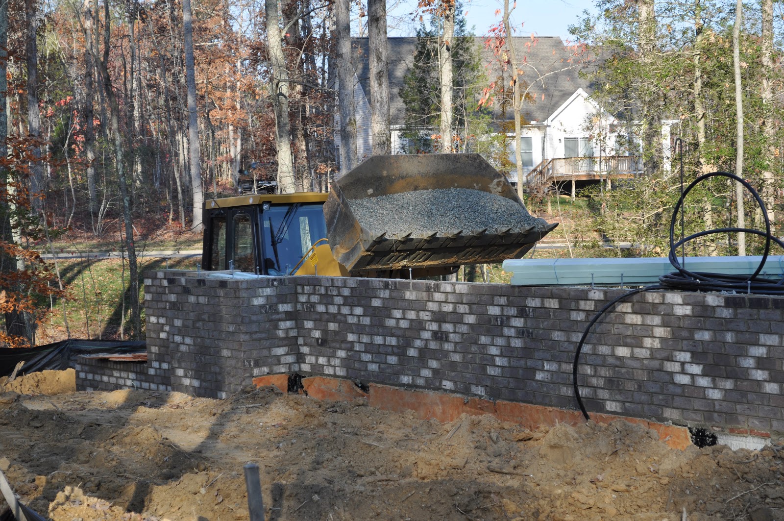
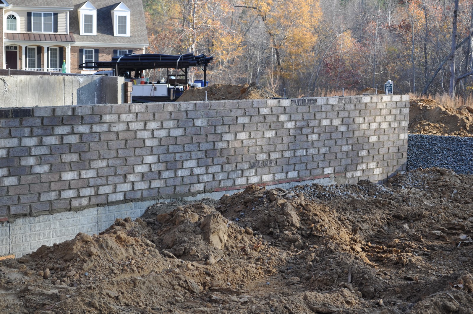
Special delivery
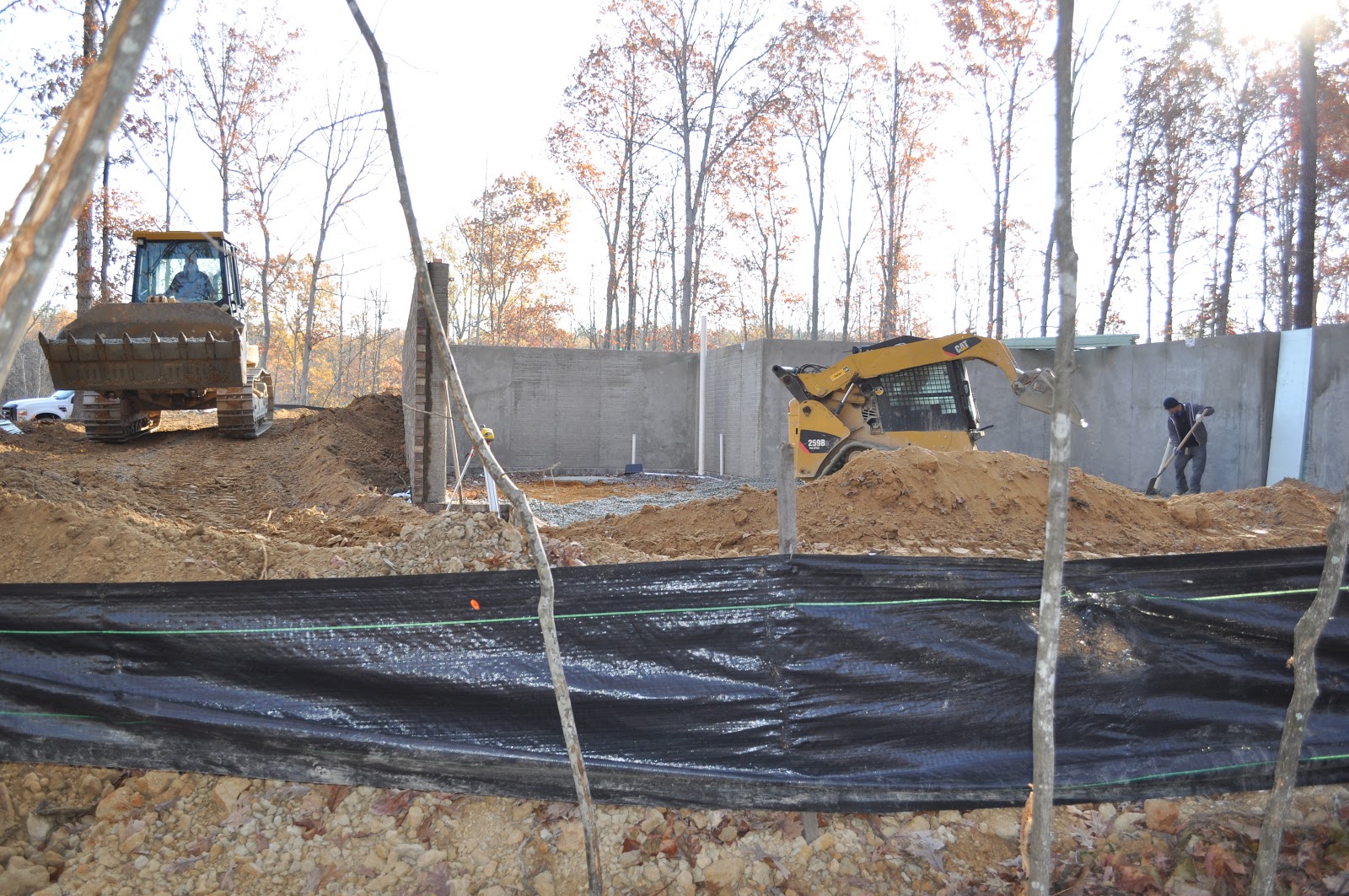
Stopped by the lot today and the basement had just been poured and two workers were finishing it of, smoothing it out. At the same time, the trusses were delivered, which I managed to catch on video.Videos
Photos


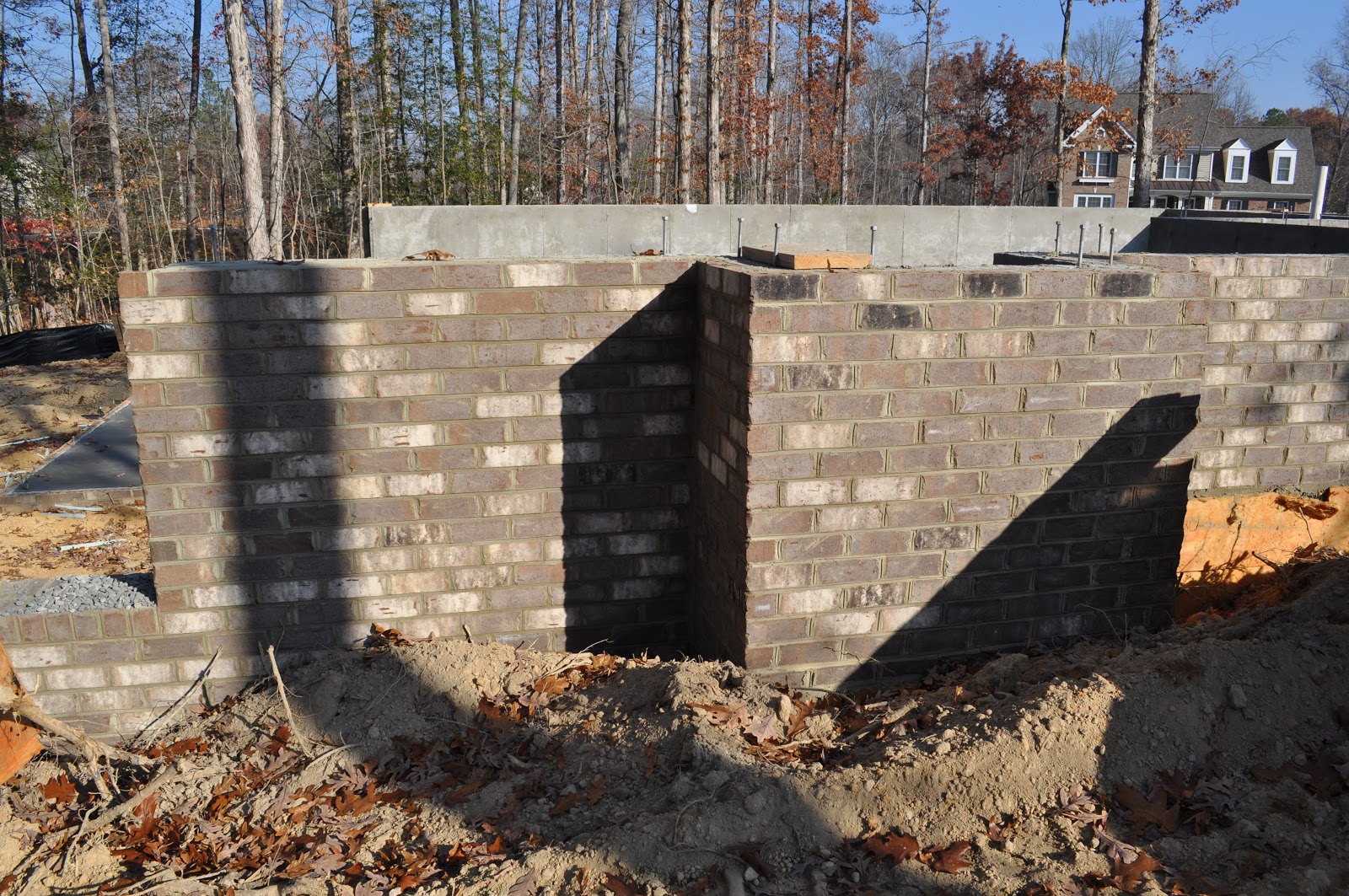


Enjoy!
Monday, November 19, 2012

Dining Room
I originally didn't intend to go full-on with the coffered ceiling, but after working with the Dining Room, and seeing some potential for color variations in the ceiling, I decided to give it a go.Here I am trying to go for a butterfly theme, or hints of enchanted forest. I'm not quite capturing that last one, enchanted forest, but perhaps it will evolve even further.
 |
| Dining Room |
The Dining Room received a sideboard, which, with an espresso color really gives an earthy texture to the room. The water color painting showing the colorful flock of butterflies, I found from Louisa Boyd, she has a number of attractive works I've seen online. The other print, showing a version of a Davinci butterfly, I found on DeviantArt by artist ~bgx1
Lastly, I applied a Merrimack pattern to the chairs, something which also helps tie this room to the Sitting Room--the pattern does not repeat very well, but I'll work on that.
Chief Architect has a project costing tool in the app, and I'm getting curious to know an estimate for materials. I think it's as easy as plugging in a few price/ft. values and voilà!
If there are other compositions you would like to see, or have criticisms, don't be bashful!
Enjoy!
Updated (11/19/2012):
Here is another render of the Dining Room. You get the full effect of the coffered ceiling, and a new water color print by Hailey E. Herrera. Based upon my colleague's advice, I intend to make the table a round table, oval with an extension. Her thinking is that square tables create hard edges that are difficult to maneuver around, a subconscious effect that might create avoidance, rather than be inviting. Of course, with the tale of King Arthur, a round table also promotes equality. If it works out, I may take it down to six chairs instead of eight, and place the other two against the wall, ready to be used for larger gatherings.
 |
| Dining Room |
Saturday, November 17, 2012

Sitting Room II
I've been pressing on with the sitting room, getting closer to something I believe would impress those who walk in the front door. It's still a ways to go, but definitely an improvement over my first pass at it. Taking the advice of my coworker and Nadase, I shuffled some things around, added some color, swapped out some furniture and arrived at the render below. The biggest realization for me was that a yellow (buttercup) couch wasn't going to work, like it was the wrong color to use in order to accentuate the area rug. Once I got over that, the room evolved into a new level of sophistication.
But as I've said, it's still not quite there yet. The biggest challenge is dealing with the flow between rooms. The composition above shows a taste of this, because the dining room has not yet received any attention. I can't just paint the dining room the same colors, and I can't just go and pick new colors either. What to do? What to do?
To show you just how significant color is, and what it does to a room, take a look at another render I did, just before adding the burnt umber shown previously.

This render is brighter, more subtle, but the furniture gets lost. Still though, I like it.
So how to achieve blending the flow of both rooms, so the Dining Room is a separate, yet logical extension of the Sitting Room? So both can stand on their own, yet be complimentary? So that a conversation in one room, can participate in conversation in the other, yet be separately told stories?
The last render may just achieve that idea! I'm a bit nervous painting a single wall two stark colors as shown in the first render above--Sage Green, and Burnt Umber. What if, we use one color in the Sitting Room, and the other in The Dining Room? Then came an idea to paint the ceiling in the same color as below the chair rail for the same room. But a painted ceiling might be too much, so perhaps add a shallow coffer to both. Now I just need to decide which color to use in which room.
This is a screenshot of the camera view before taking a render. It shows a 6 square, coffered ceiling in each room. Perhaps 9 square would be nicer.

I thought the burn umber would look nice in the Sitting Room to give contrast to the cream-colored furniture, while the Sage Green color would look nice in the Dining Room to give contrast to that furniture.
Updated (11/18/12):
I created a render for the Sitting Room with the paint scheme and coffered ceiling over the night and here it is:

Updated (11/19/12):
And again will a full coffered ceiling.

Thanks for following along! It's definitely an iterative process, but perfection is sure to be found!
Friday, November 16, 2012

Sitting Room I
It's depicted as the "Living Room" but, I like to call it the Sitting Room--a place to congregate after a formal dinner, a place to read, a place to invite guests in for transient conversation.I've just started working on it, so the render has a ways to go.
 |
| Sitting Room |
Here’s what I came up with for enhancements to the “Sitting Room”. If you have any ideas, feel free to reply!
Loveseat

Chair

Changes
- cut a large hole in lower shelf of coffee table to expose more of the area rug
- make wicker texture on coffee table a smaller print
- make legs of coffee table hard wood (see what can be done in Sketchup)
- add chair rail to all walls
- paint lower part of wall burnt umber(red) to match accents in area rug
- change out loveseat to use link above (keep same texture—buttercup)
- change out chairs to use link above (keep same texture—brown)
- curtain rod should be same charcoal color as lamp stands, and Aztec Calendar molding
- replace vases by window with a chest, and add some books or blanket on top (helps viewer know where the open book on coffee table came from)
Questions/Comments
- Does the right corner need some accent artwork?
- Do the lamps/shades work?
- This room embraces circles
- The Aztec calendar may be too big, may need to be darkened up a bit, as if fashioned in clay or oil-rubbed bronze
- Does the reading lamp work, how can it be changed?
Response:
- I think we could amp up the textures in the room by adding sofa-side tables with a satin finish (in stained or painted wood).
- The matching side tables and lamps are predictable. I might try mixing them up and still try to achieve balanced visual weight on both sides of the sofa.
- I like the idea of adding a chair rail. Crown molding would be nice too.
- The sage green color in the rug would really warm up the walls and make the curtain color look fresh. Sage green on top would look nice with the burnt umber below the chair rail.
- Tab top curtains tend to create visual clutter between the rod and the body of the curtain. You might want to try a simple pinch pleat-style or perhaps grommet-style curtains with yellow gold or oil-rubbed bronze rods.
- The wall medallion (Aztec Calendar?) is a bit heavy in its current place. It might work better on a side wall.
- People using the side chairs need a place to set a drink or a book. A small side table on the left could work well. Maybe a tray-top storage ottoman on the right would add function. This would replace the vases and take the place of a chest.
- I like both loveseats (the one in the picture and the one in the link).
- The floor lamp adds bling … maybe a yellow gold finish would fit the room.
- Final touches (wall art, table top accessories) can be added last.

Hits close to home
Stopping by the lot is becoming a daily routine, and growing into an enjoyable part of my day, something to look forward to.It's amazing to think that such a force of action such as building a home can result from such a simple idea, a simple need--home. I've easily taken for granted all the feats human kind has created, bridges, sky scrapers, rocket ships, it's nearly endless, but here, this idea hits close to home (pun alert).
And to my enjoyment, I owe the thoughts and ideas of many others who've come together into a veritable symphony of possibility, they are the foundation of my new home--my new Rome. Sure, there is more to go, but this massive displacement, and the excellent work performed thus far, is creating a genuine space of satisfaction.
Thank you for your good work!
Video
Last Night Photos


Today's Photos


Subscribe to:
Comments (Atom)